Beverly Hills Library - demolished
Remembering Beverly Hills’ MCM's Public Library
The midcentury oasis for reading was replaced more than 25 years ago
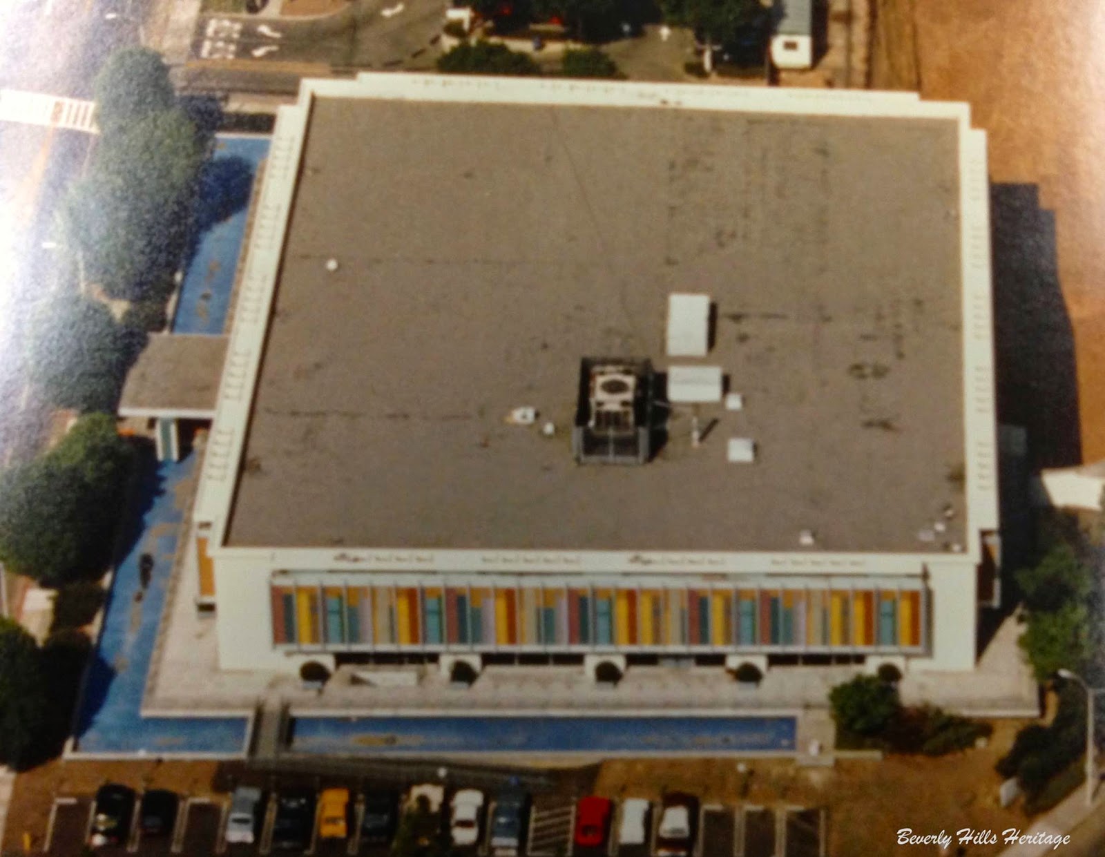
Did you know that the old Beverly Hills Library built in 1965 was designed to appear as a row of colorful books on a shelf?
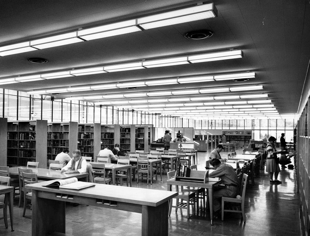
If I could go back in time and return a single L.A. building to its former state, I would pick the old Beverly Hills Public Library. I sat happily with other children on the floor of its screening room, listening to the impeccably tailored Suzanne Pleshette read Hansel and Gretel in the late 1970s. A unique light reflected off the library’s colorful glass façade and through its windows, bathing the interior in a magical radiance. My love of reading still reminds me of that glow.
The Beverly Hills Public Library opened on October 10, 1963. It’s designer, Martin Stern, was making his mark as a major Las Vegas architect at the time and working with developer Del Webb, who built the Flamingo Hotel for Bugsy Siegel and Billy Wilkerson. Stern had work lined up in L.A., too—the same year he worked on the library he designed space age coffee shops for the chain Ships, which helped define L.A.’s drive-in culture, and he was busy creating the midcentury homes that gave neighborhoods like Trousdale and Encino their unique looks. According to Vintage Los Angeles member Phil Savenick, the library was commissioned at least in part thanks to filmmaker David O. Selznick’s assistant, Marcella Rabwin. She thought children deserved a better place to read and discover books than the temporary quarters that had been set up in a wing of Beverly Hills’ City Hall.
I think the library was Stern’s best work. It was on Rexford Drive, the street where I grew up, and a child’s dream during the ’60s and ’70s. The library had a state-of-the-art screening room with a step down reading area. Every month a guest speaker from a popular TV show or motion picture came to read to toddlers. It was an “only in Hollywood” kind of affair—and in this case, only in Beverly Hills. The library also had a vast collection of music titles on LP. When I first learned to drive and parking meters cost only a few nickels, I checked out the latest records on Saturday mornings.

The library’s design was as special as its programming. Mosaic tiles reminiscent of the murals built in 1961 to dress up the tunnels at Los Angeles International Airport wrapped around the structure, mimicking a row of colorful book spines made of glass. The structure itself sat far back on the property, leaving room for a massive green lawn with modernist fountains.
If anyone were ever to create a West Coast version of Mad Men, the library would have been a perfect stand-in for a 1960s office building. In fact its exterior appears as Mike Brady’s architecture firm in stock shots from The Brady Bunch.
Screen Grab from the Brady Bunch
Sadly, the city extensively renovated the treasure in the late ’80s to build a bigger library. Rumor has it some of the original structure remains beneath the new building’s facade. The library that opened on September 11, 1990 looks completely different. It’s in the Spanish revival/Art Deco style, and it’s missing windows for natural light, magical or not.
I often wonder about L.A.’s attitude toward history. Despite so many of our buildings being immortalized on screen, retro architecture is getting harder and harder to find in real life. Los Angeles isn’t alone in that regard. The Riviera in Las Vegas, one of the last Martin Stern-designed hotels from the Rat Pack era, will be coming down in 2015. As Frank Sinatra would say, “That’s life.”
The Mosaic Tiles on all sides of the building (reminiscent of those in the tunnels of LAX airport) represented a spine of books made out of colorful glass. And the fountains surrounding the structure like a moat was extremely charming. Los Angeles was sprawling with water designs, ponds, brutalist sculptures and tiled art in the 1960s. I remember seeing something modernist and groovy on almost every corner until the late '80's.

I really do have such fond memories of this library that was located on Rexford Dr. It was a child's dream during the 60s and 70s. It had a state of the art screening with a step down living room. They also had a vast collection of music titles where I used to check out the latest records. I went every other Saturday as a kid and the parking meter cost my mom a nickel.
The Library opened on October 10th, 1965 and was designed by Martin Stern. Stern was the designer of Mid Century homes in Trousdale and Encino and various Las Vegas Hotels and restaurants including Ships Coffee Shops that have sadly all been demolished. And tragically this Mid Century modernist marvel was built over in the 1980s to build a bigger library and more offices. The late '80's structure looks like a generic fake Spanish revival / art deco debacle right out of Miami Vice. The inside of the new library also lacks natural light and feels like you're studying in a tomb. Probably because construction ran out of money midstream.

Here's a bit of pop culture Bradybuncherie trivia for you loyal fans:
The exterior of the old public library, appeared in stock shots in The Brady Bunch
as Mike Brady's Architecture firm.
I have NO idea why they tore this MASTERPIECE down to build an unauthentic and boring replacement that stands today...but that's LA. Here today, ripped down tomorrow. I wish we could dig this back up along with fountains too. What a beautiful example this was of LA architecture that should have served as precedent and inspiration.
I have heard through the years that some of the original structure is underneath the new Facade. So if you see someone in the middle of the night with a ladder and a hammer that might be me pealing back some of the fake facade... SHHHHHHH....
Library 1965 Reading Room photo by Julius Shulman
The colors back then were so bright, yet so understated. So much thought and harmony. So vibrant and sunny!

Not like today's beige Tuscan stucco. Here's photo of the library that took it's place. Sorry Beverly Hills, you made a big mistake letting this one get away...
Another wonderful building that bit the dust.
Alison Martino is a writer, television producer and personality, and L.A. pop culture historian. She founded the FACEBOOK PAGE Vintage Los Angeles in 2010. In addition to writing for Los Angeles Magazine and VLA, Martino muses on L.A’s. past and present on Twitter and Instagram
alisonmartino.com


.jpg)


Wow, it's so pretty! Someone in LA needs their eyes checked if they tore that down. I mean, I can understand a more modern set of wiring and such, but that darn Moorish/Spanish style is so freaking boring and over done. This is colorful and so much more inviting.
ReplyDeleteNow if the inside is anything like the branch where I work, I could totally understand gutting it and making it more modern. (For instance, our's was built before the American's With Disabilities Act so it's not very handicapped accessible.) And granted, I wish our's was a bit bigger as well.
Sometimes I really wonder about the LA area. So much of it has been immortalized in tv shows and movies you'd think people would be all about preserving buildings like that as tourist attractions. But they're so quick to tear everything old down. From buildings to the entertainers.
I thought it was demolished because of asbestos problems.
ReplyDeleteThank you for the beautiful pictures of this wonderful piece of retro architecture.
ReplyDeleteAlison, I just discovered this blog, had no idea and we've been Facebook friends for months! I know what I'll be doing for the next coppola hours! ;0)
ReplyDeleteThanks for sharing your vast collection of pics, stories, memories and knowledge!
Todd
I love this site and the Facebook page, but, where did it go? Did Facebook take it down?
ReplyDeleteActually (and this was confirmed directly by Nancy Hunt-Coffey who's the director of Library Services) they didn't tear it down. The new library was built around the old one because they thought it would save money. Of course, it didn't and Beverly Hills is still paying on the cost overruns on the Civic Center. The Civic Center itself was only 75% of what it should have been because of soaring costs. Charles Moore planned water features throughout, including a boat pond in the big hole in the plaza, a large water cascade into it on the Civic Center Drive end, fountains in the Palm Court and a water feature cascading down the tile area on either side of the handicap ramp to the Rexford Drive entrance to the plaza. Not that would have made it excellent architecture, but it would have been better than what we got. But I do miss the old library and the old fire station..
ReplyDeleteYes, it was an extensive remodel. A factor contributing to the "cost overruns" was the unrealistically low original cost estimates, prepared by each of the firms (duh!) submitting entries in the design competition, from which Moore's design was selected, so the actual cost seemed high...among other reasons.
DeletetmOO, VERY INTERESTING!!!
ReplyDeleteHOLY MOLY! I remember being so small and in those gardens. The city was so stupid for getting rid of that beauty and replacing it. Woe is me!
ReplyDeleteNow, that was a library to be proud of: dedicated and educated staff, great, open, sunny building, and a quality collection. I miss it now more than ever.
ReplyDeleteI was told by the man who was librarian there during the reconstruction that the cutbacks forced them to reduce the number of electrical outlets. This was when PCs were coming into greater use, and the result was an insufficient number of spots to plug them in.
ReplyDeleteWhen I was little it was this
ReplyDeleteMagical Mosaic Masterpiece where my Imagination could run wild ..It was a playhouse where I could take SNY Book I wanted...But I had to Reluctantly give them Back !...I really really Miss that place !
Going, going, gone. Please advocate for preservation of Modern gems before they get refreshed with ugly face lifts.
ReplyDelete